Timeless Interior Design Trends for Modern American Homes
In interior design, truly timeless spaces tend to share one quiet, underlying principle: balance. Not just “symmetry,” but a deeper sense of visual harmony that feels right, even if you can’t explain why. That instinctive feeling is often closely tied to the golden ratio.
The golden ratio, approximately 1:1.618, has been used for centuries in art and architecture, whether consciously or intuitively. In interiors, it becomes a powerful design guideline that can shape layouts, furniture proportions, color blocking, and even how you style your shelves. The result is a room that doesn’t scream for attention, but feels enduringly calm and well-resolved.
Below are key interior design trends and practices inspired by the golden ratio—and why they tend to age well instead of going out of style.
1. Harmonious Room Layouts
A room often feels “off” when furniture is either crammed against the walls or clustered awkwardly in the center. The golden ratio helps you plan layouts that breathe.
Zoning by proportion
Instead of splitting a room in half, use the ratio to divide space. For example, dedicate roughly 60% of the floor area to a main seating zone and 40% to secondary functions (a reading nook, desk area, or dining corner). This avoids the feeling of a room cut into rigid halves and creates a more natural flow.
Circulation paths
Leave walkways that reflect similar proportions: aim for circulation paths that feel generous without wasting space—often around one “golden” share of the room width rather than a thin corridor squeezed between furniture and walls. It’s not about exact measurements, but about a comfortable ratio of open space to occupied space.
Anchoring a focal point
Place major focal elements (a fireplace, a large artwork, a TV wall) so they aren’t centered perfectly. Positioning them closer to one-third or roughly the golden section of a wall provides more interest and dynamism while still feeling balanced.
2. Proportionate Furniture Selection
Trendy furniture silhouettes come and go, but well-proportioned pieces always feel current. The golden ratio is a quiet reference when judging scale.
Sofa and coffee table pairing
A coffee table that’s about 60–65% the length of the sofa generally feels balanced. If your sofa is 210 cm long, a coffee table around 130 cm will look harmonious, leave just enough side space, and be practical for use.
Seat height and backrest
Chairs and sofas with backs roughly 1.6 times the seat height often read as comfortable and visually stable rather than squat or overly tall. You’re aiming for a silhouette that supports the eye in a smooth upward movement.
Dining table proportions
Rectangular dining tables often feel best when the length is around 1.6 times the width. This gives enough room for comfortable place settings and circulation without feeling like a narrow banquet table or a bulky slab.
Case goods and storage
For cabinets, consoles, and sideboards, consider the relationship between height and width. A sideboard that’s too tall for its width feels top-heavy; one that follows a 1:1.6–1.7 proportion will sit more naturally along a wall and better complement art hung above it.
3. Balanced Wall Compositions and Art Arrangements
Wall decor is where the golden ratio can be used very visibly yet subtly to create timeless arrangements.
Art above a sofa or console
Instead of spanning the entire width, aim for artwork (or a grouping of artworks) that’s around 60–70% of the furniture width below. This leaves breathing room on the sides and naturally frames the vignette.
Gallery walls
A gallery wall feels coherent when the overall shape fits a roughly golden rectangle rather than a perfect square or a long, thin strip. Within that, aim for a dominant piece about 1.6 times larger than the secondary pieces nearby. Your eye will find and rest on that anchor, making the composition readable and calm.
Vertical vs. horizontal emphasis
When deciding orientation, consider the proportion of the wall area you’re working with. If a section of wall is noticeably taller than it is wide (or vice versa), echoing a golden-relation version of that rectangle in your art grouping helps avoid awkward voids and patchy clusters.
4. Color Blocking and Surface Proportions
Color trends shift quickly, but the distribution of color in a room can keep things feeling timeless regardless of palette.
60–30–10 rule, refined by the golden ratio
Designers often use 60% main color, 30% secondary, 10% accent. This echoes the idea of dominant and subordinate proportions. Instead of splitting color use evenly, let one color clearly lead, with others supporting it. This keeps a space from feeling visually noisy or overdesigned.
Feature walls and paneling
When adding a feature wall, avoid splitting a room exactly in half with color or cladding. Let the feature occupy closer to 60% of a visual field or wall run, with the remainder left calm. Similarly, for wainscoting or wall paneling, a lower panel around 1/3 to 2/5 of the wall height (rather than a rigid half) tends to feel more elegant and historically grounded.
Rugs and floor treatments
A rug that’s about 60–70% of the room’s visible floor area (or of the seating zone) ties pieces together without suppressing the sense of space. In open-plan rooms, rugs laid out in golden-ratio relationships to each other help define zones without harsh partitions.
5. Layered Lighting in Golden Proportion
Layered lighting will outlast any specific lamp trend, because it’s grounded in how we experience space. The golden ratio can help distribute lighting types.
Ambient, task, accent
Design with a clear hierarchy: most of your lighting should come from ambient sources (ceiling, integrated coves, large floor lamps), a smaller but significant part from task lighting (desk lamps, reading lights, under-cabinet strips), and a final, more minimal portion from accent lighting (picture lights, small spots, candles). Each type should occupy a smaller “share” of the total, roughly echoing that diminishing sequence (1, 1/1.6, 1/1.6²).
Fixture grouping
When grouping pendants over a dining table or island, let one element be visually dominant—by size, height, or brightness—and keep the others proportionately smaller or dimmer. Avoid giving every element equal weight; instead, make each subsequent piece feel like a “smaller echo” of the main one.
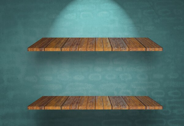
6. Shelving, Styling, and Decorative Groupings
How you arrange objects plays a huge role in whether a room feels cluttered or curated.
Rule of odds with golden spacing
Group objects in threes or fives, with one clear focal piece, one medium, and one small. Their relative sizes approximate a golden progression: large, medium at roughly 60–70% of its size, and a small piece that’s again reduced. This gives rhythm and a clear visual story.
Negative space as a design tool
Leave deliberate empty space between clusters on open shelves. Rather than spacing items evenly, allow larger gaps between major groupings and slightly smaller gaps within a group. This varied spacing is more in line with natural, golden-ratio rhythms than a regimented grid of objects.
Vertical layering
Stacks of books, a taller vase, and a low bowl layered in a golden-type progression of heights create a gentle staircase for the eye. You don’t need a ruler; you’re simply aiming for a natural stepping pattern rather than abrupt jumps or flat lines.
7. Architecture, Openings, and Built-Ins
Truly timeless interiors are often rooted in the architecture itself—doorways, windows, and built-in elements that feel “meant to be” there.
Window and door proportions
Historically, many classical windows and doors echo golden-rectangle proportions rather than pure squares. Whenever you have influence over new openings or renovations, slightly taller-than-wide ratios tailored near 1:1.6 often read as more graceful and enduring.
Niches and alcoves
For recessed niches and shelves, echo the golden rectangle instead of uniform cubes. This can be used in shower niches, living room display recesses, and even kitchen alcoves around a range. The slight elongation feels refined, whereas perfect squares sometimes feel boxy or utilitarian.
Built-in cabinetry
Tall wardrobes and bookcases that are divided in golden-related sections—e.g., a larger lower portion for closed storage and a shorter upper section for open shelving—feel more integrated with the room than a single monolithic block.
8. Why Golden-Ratio Interiors Age Gracefully
Design movements and materials cycle—mid-century one decade, maximalism the next—but proportional balance endures. Interiors that lean on the golden ratio tend to be timeless for several reasons:
- Human perception is consistent. Our eyes and brains are drawn to certain relational patterns. The golden ratio is one of the most studied of these.
- Proportion outlasts pattern. Colors, prints, and materials can be updated without rethinking the bones of the room if the underlying layout is well-proportioned.
- It supports calm rather than spectacle. Spaces designed with this kind of balance rarely feel jarring, even when you introduce bolder accents. The foundation is stable.
9. Applying the Golden Ratio Without Getting Obsessed
The goal isn’t mathematical perfection. Interiors are lived in, not drafted with a compass and calipers.
A practical approach:
- Use the golden ratio as a guide, not a strict rule.
- When faced with a choice—half vs. two-thirds, perfectly centered vs. slightly offset—lean toward the option that echoes a golden-like proportion.
- Step back and check how the space feels. If it looks calm, coherent, and natural, you are likely close enough.
In essence, timeless interior design is less about memorizing a number and more about cultivating an eye for balanced relationships. The golden ratio simply gives that instinct a language. When you let it inform how you divide space, choose furniture, arrange art, and layer objects, your interiors gain a quiet, enduring harmony that transcends trends.